So, tell me, what do you think of the new header?
I had a few other images here before to choose from, but I decided...the panorama of Pittsburgh that I posted over at flickr just seemed to be the best fit.
Some folks wondered why the contrast was off. I changed the 'transparency' to accentuate the text in the box. Also, I like it against the black background.
Since the map's gone (and the people celebrated), I felt the page needed something.
And now we return you to your regularly scheduled blog.
skip to main |
skip to sidebar
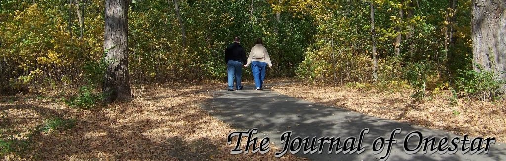

It's kinda fitting I'm walking away with my wife in this photo, since I've walked away from this blog. After almost 20 years, The Journal of Onestar is no more. I'll leave these posts here for awhile. Oh, and to my stalkers, thanks for visiting. See you around sometime...
Who am I?
- Eric S.
- And I'm actually pretty cool with just being me.
Who else is there?
- My Love
- Full Moon and High Tide (Private)
- The Flower Pot (Private)
- pros/e/yes
- Act Like You Know (Private)
- This is My Inside Voice
- World of Weird-Z
- Randomness (Private)
- Explosive Blogorrhea
- The Knitting Librarian
- Our House
- Fotografaire
- Techmiso
- Lady Twiglet Photography
- From Rain To Hope
- Leghump Blog Orgy
- Cerise Rouge
- Mobile Photo
- Post Secret
- I Found Your Camera
- Chickweed Café
- All Kinds of Stuff
- BLDGBLOG
- The White House Blog
- Bizarro!
- Tales from the Discount Bin
- Singularity Point (Private)

21 comments:
looks good to me, it looked a little empty without the map but this looks great ((better than the map))
Let's see...I've three to choose from, and I'm gonna upload 'em all here, and see which folks think is best.
Why are they all in such low contrast? Makes them seem very bright compared to the black background, sticks out a lot.
I think I like the city shot the most, especially if it was darker or had better contrast but I'd have to see how it looked in action.
I like the city skyline scene/overview the best.
Maybe darken it a tiny bit so it isn't so harsh looking against the black?
I think I understand the contrast now, Ones. It is so the text is easier to read against the phot background...right?
I get it! Good show.
I went with the low contrast...really a transparency layer...so the text would stand out more.
I also kinda like the way it looks against the dark background, but that's just me.
And yeah, looks like the city one's the winner!
definitely the one you have now, the city one *nod*
I like it. ^^ I guess I missed the others though. poo :(
and why did you take off the map? Just curious. (nosy *L* eep)
I like the way this looks, great going! :)
I thought the map was cool. lol
i obviously missed the other choices, but it looks great Mr Onie :)
I missed the other, I guess...but I like this pic you've got up. *nod*
I like the header you have up...it looks really professional, and gives your site the "personal" touch.
To tell the truth, I didn't dig the map too much...I'm going to show my age here, but it always reminded me of the final scenes of that old movie "Wargames" with Matthew Broderick....
"Good Evening, Professor Falken. Shall we play a game?"
Man, have we come a long, long way or what?
I didn't like the map, and you know why. :)
I think the map looked cute, but you took it down for a good reason :)
I like this pan shot of Pittsburgh and high contrast or not, it works.
Very cool Onie-man *nods*
oh the map thing.. it reckoned I was from sydney so..... lol
The other images were ones you've seen before, and they're over at my flickr page.
One was the panorama from PNC park, and the other is Serenity...which I still have to post over at SA, for those who've missed it.
As for the map...well...I have my reasons. :)
Tap-tap, tap-tap. :)
Hi, sweetie.
Onie? Oh OOOOOOOnnnniiiiieeee.
Hello?
Hm.
Post a Comment